Special Collections launches new website

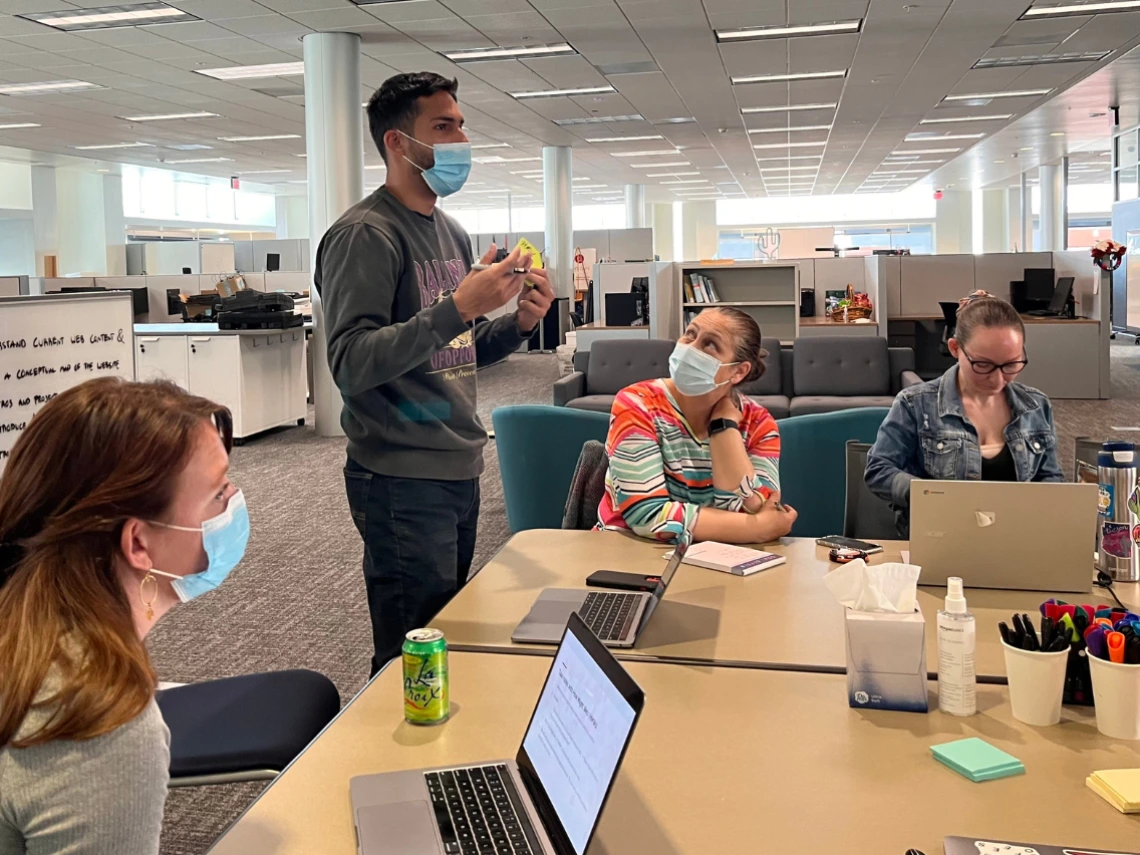
Photo by Bob Liu
The University Libraries' Web Refresh team unveiled a fresh Special Collections website on April 8, marking a significant milestone in improving the experience and accessibility for users.
The project team of library staff from the Technology Strategy & Services (TeSS) department’s Development team and the Administration department’s User Experience, Analytics & Assessment (UX) and Marketing Communications teams began discussing a new library website several years ago. The phased project has resulted in new, refreshed content on our main website, including the launch of the new Health Sciences Library website.
However, the journey to the successful Special Collections website launch was not without its challenges.
Addressing technical pain points
The previous version of the Special Collections website, which was last updated in 2013, faced several technical hurdles and limitations. Some of these pain points included:
- Outdated architecture: The site's structure didn't align with current standards, leading to disjointed user experiences.
- Feature disparity: The site lagged behind the Libraries’ main website in terms of functionality and design.
- Search inefficiencies: While a new search feature was implemented, it sometimes provided less relevant results for users.
- Content integration: Collection information had to be manually entered separately, creating inefficiencies.
- Unique branding: The site had a custom design that diverged from the University of Arizona branding.
Collaborating from the start
The team kicked off the Special Collections refresh project with a five-day collaborative planning activity in April 2023.
UX and Special Collections staff worked together to understand the previous Special Collections website, identify top pain points, plan design solutions, and confirm the project priorities. This process provided valuable, candid feedback to trim unnecessary features, ensuring a more focused and effective website.
Several issues were addressed by identifying key solutions:
- Creating a simplified content structure: Content editing and maintenance are now easier and more efficient due to a streamlined web architecture.
- Implementing ArchivesSpace integration: TeSS developers, UX, and Special Collections staff implemented an integration on the new website with ArchivesSpace–an online archival collections management system–saving staff time and effort to update collections content that is now seamlessly synced.
- Using an iterative approach: The team adopted an iterative approach to continually identify the most important features for the launch, avoid leaving items unfinished, and implement planned features over time.
Prioritizing plain language, accessibility, branding
The Web Refresh team wanted to ensure that Special Collections was accessible to everyone—whether they are using the website or visiting Special Collections in person.
Using clear, plain language, the team focused on explaining core features of Special Collections and helping first-time visitors seamlessly access and navigate the collections to find what they need.
The new How to use Special Collections section, which was designed collaboratively with staff representing different Special Collections department units, explains how to plan a visit, use our collections, and get research assistance. In addition, new content on each collection page explains what you will find in a collection, how to access materials in-person and cite materials, and how to view related digital collections and online exhibits.
The refreshed website boasts other enhancements as well. The revamped search infrastructure delivers more relevant results with minimal maintenance, and the website’s look and feel aligns with the university's brand, promoting consistency with other sites in the University Libraries’ web presence and other University of Arizona websites.
UX research validated the new design and navigation when we tested how people actually use the website. More than 60 participants, including University of Arizona faculty and instructors, graduate student researchers, visiting researchers, first-time visitors at Special Collections, and library staff, were recruited for the usability testing.
Before launching, the UX team conducted another test and found that most people could easily do common tasks on the new site about 80 percent of the time.
What you should know
- The new Special Collections website is a part of our University Libraries main website. You can find it from Libraries & locations > Special Collections.
- Links that you've shared or bookmarked on the previous Special Collections website will still work.
- We'll continue to gather feedback about the website.
- Contact web-support@lib.arizona.edu if you notice any broken links or errors or have questions.
Overall, the launch of the new Special Collections website marks a big step forward for the University Libraries, thanks to collaborative efforts and strategic improvements.
Stay tuned for more website updates happening this year, and a special thanks to the Web Refresh team who worked on the project!
Marketing Communications
Aengus Anderson, Oral Historian & Digital Media Producer
Bobbie Chong, Communications Specialist
Kenya Johnson, Director
TeSS-Development
Ginger Bidwell, Lead, Project & Portfolio Management
Mike Hagedon, Lead, Development
Ashvini Kabadi, Applications Developer Programmer, Analyst II
Andy Osborne, Senior Developer
Rich Yu, Developer
Raquel Zevallos, Developer
User Experience
Leonardo Echeverria, former User Experience Researcher
Aly Higgins, Content Strategist
Hoa Hoang, User Experience Student Assistant
Bob Liu, User Experience Strategist
Megan Straffon, User Experience Student Assistant
