Winners of the 2021 Data Visualization Challenge announced
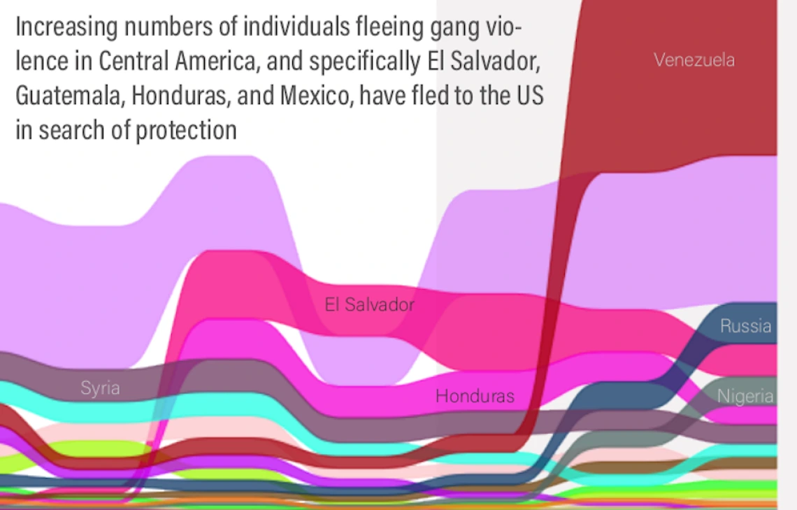
Heidi Steiner's data visualization demonstrates the population movement of asylum seekers during the last 20 years.
We’re happy to announce the winners of the 2021 Data Visualization Challenge.
Undergraduate and graduate students from different disciplines were invited to submit visual displays of data to tell stories. This is the second year that the Libraries’ Office of Digital Innovation & Stewardship (ODIS) has sponsored the event.
The winners received awards for first place ($250), second place ($150), and third place ($100). View the winning entries and access the digital collection.
"The Challenge highlights the power of communicating through graphical representations of data," said ODIS Data Science Specialist Jeff Oliver. "We're providing University of Arizona students the opportunity to showcase their skills and network with the greater data visualization community."
Students who participated this year definitely agree.
Tintin Nguyen, the first place winner in the undergraduate student category, sees the Challenge as an engaging opportunity for students to share their data science work and learn from each other's expertise in other fields. “I was motivated to join the contest because I believe that numbers and data are exciting and colorful concepts rather than dull topics that require rote memorization, as a mathematics enthusiast,” said Nguyen.
“I was excited to participate in the Data Visualization Challenge after I heard about last year’s contest a bit too late,” said Heidi Steiner, the first place winner in the graduate and professional student category. “I think data visualization is easily the best part of science, and I was excited to push myself to use data outside my field.”
Melanie Gin was encouraged to submit her data project about banned books by a university lecturer she had for a class last fall. “It turned out really good, and I put in a lot of time gathering the data,” said Gin, who placed second in the undergraduate category. “The experience gathering the data was fun though since I discovered details about the situations.”
“I was interested when I heard about the Challenge because developing visualization skills is important to me,” said Kathryn Busby, third place winner in the graduate and professional category. “I like sharing and seeing what creative data interpretations others have built.”
One of the evaluation committee members benefitted from the Challenge as well. Devin Bayly, research computing specialist from University Information Technology Services, said, "I had a good time flexing some data visualization theory that I honestly should be using more in my own work."
Undergraduate student winners
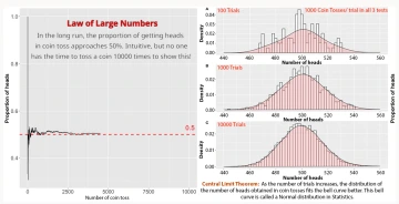
First place: Tintin Nguyen, Astronomy
Abstract: The Law of Large Numbers and the Central Limit Theorem are two of the most fundamental and elegant theorems in Probability Theory. However, these concepts are impractical to demonstrate because they require an immense number of trials to observe the long-term behaviors of random variables. Therefore, this case study runs computer simulations on coin tossing as an intuitive example to explain these statistical concepts. The visualizations provide insights into the theorems without mathematically rigorous proofs, making them accessible for introductory statistics learners.
Second place: Melanie Gin, Information Science & eSociety and Computer Science
Third place: Ashwin Raj, Mathematics
Honorable mention: Torin Hodge, Biosystems Engineering
Graduate & professional student winners
First place: Heidi Steiner, Pharmacy Practice and Science
Abstract: Every year people come to the United States (U.S.) seeking protection because they have suffered persecution or fear that they will due to their race, religion, nationality, or membership in a particular social group. Asylum is a protection granted to foreign nationals already in the U.S. or arriving at the border who meet the international law definition of a “refugee.” This visualization aims to understand population movement during the last 20 years. I use aggregated refugee and asylee data from the Department of Homeland Security. I show patterns in population movement vary over time based on political failures preceding movement.
Second place: Elaine Rhee, Economics
Third place: Kathryn Busby, Entomology and Insect Science
Honorable mention: Christina Scarpitti, Urban Planning
This year’s evaluation committee included: Jim Martin, University Libraries; Kelsey Gonzalez, College of Social & Behavioral Sciences; Devin Bayly, Research Computing, University Information Technology Services; Jennifer Mason, School of Geography, Development & Environment, College of Social & Behavioral Sciences; and Philip Stoker, College of Architecture, Planning and Landscape Architecture.
ODIS provides several services to support students with data visualization. Geospatial Specialist Kiri Carini provides workshops, one-on-one consulting services and drop-in hours on GIS software and geospatial data. Data Science Specialist Jeff Oliver offers workshops, one-on-one consulting services, and drop-in hours for R and Python software.