2020 Data Visualization Challenge winners announced
Congratulations to the winners of the 2020 Data Visualization Challenge hosted by the Office of Digital Innovation & Stewardship at the University of Arizona Libraries. They are Kelsey Gonzalez, Reagen Leimbach, Rob Lucha, Stephanie Martin, Miranda Rintoul and Jazmyn Winzer.
The contest was open to all University of Arizona students, and undergraduate students were judged separately from graduate and professional students. The first, second and third prize winners received awards of $250, $150 and $100.
Data Curation Librarian Chris Kollen said, “We wanted to hold the challenge to demonstrate the creativity of University of Arizona students’ use of visual displays of data to tell stories.” Data visualizations take the form of maps, charts, graphs, data art and 3D models. They can also be static, animated or web-based interactive stories.
"My background is in stats, so for me data visualization usually means conveying a large amount of information directly, unambiguously, and often without strong sentiment," said Miranda Rintoul, second place winner in the graduate student category. "For this project, I decided to work outside of my comfort zone and create a visual that was opinionated, heavily detailed, and downright shocking. I'm grateful to have had the opportunity to try my hand at a different type of data visualization."
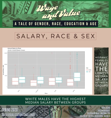
"I have always believed that data visualization and graphic design go hand-in-hand with one another," said Rob Lucha, third place winner in the undergraduate student category. "Using my knowledge in RStudio inferential statistics and machine learning, I was able to compile correlations and machine learning algorithms which helped predict wages based on sex, race, and age. This contest was a perfect match for my abilities, gave me something to work on while finishing up my senior year, and helped me keep my mind clear of the pandemic."
The Office of Digital Innovation & Stewardship provides several services to support students with data visualization. Geospatial Specialist Kiri Carini provides workshops, one-on-one consulting services and drop-in hours on GIS software and geospatial data. Data Science Specialist Jeff Oliver offers workshops, one-on-one consulting services and drop-in hours for R and Python software. The Main Library CATalyst Studios also hosts training on Adobe Creative Cloud by Brian Puente from the Office of Digital Learning and 2D/3D visualizations by Devin Bayly from University Information Technology Services Research Computing.
The Libraries plans to hold the contest annually. This year’s judges included: Chris Kollen; Elizabeth Kline, associate librarian; Blake Joyce, assistant director, University Information Technology Services Research Computing; Adriana Picoral Scheidegger, PhD candidate, Second Language Acquisition and Teaching; and Janet Rothers, Clinical Assistant Professor, Nursing.
Graduate and professional student winners
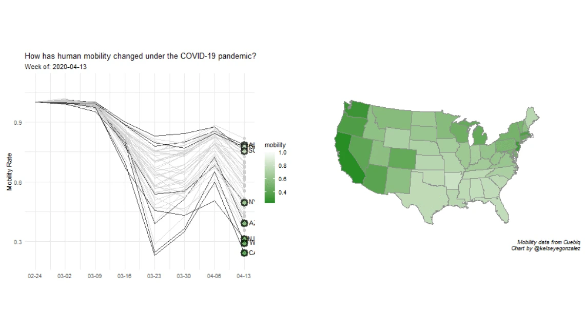
1st place: Kelsey Gonzalez, How has human mobility changed under the COVID-19 Pandemic?
Abstract: This visualization aims to understand population behavior during the COVID-19 pandemic. I use aggregated human mobility data (how far people move each day) from Cuebiq, an offline intelligence and measurement marketing company, which partners with 86 apps to collect first-party location data. Different U.S. states have handled the Covid-19 Pandemic in vastly different ways, with some states still refraining from issuing stay-at-home orders. This has led to very different mobility behaviors by state. I show that the stay-at-home order successfully reduced movement during the week of March 23rd and April 13th, with Americans reverting towards pre-COVID-19 movement patterns in between. See the animated version.

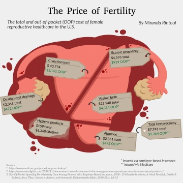
2nd place: Miranda Rintoul, The Price of Fertility
Abstract: This visualization gives an overview of the cost of women's reproductive healthcare in the US, both insured and uninsured. The procedures shown are ones that many women can expect to go through at least once during their lifetimes - such as childbirth or abortion. The majority of data is taken from a Health Affairs paper about maternity care and Medicare.gov.
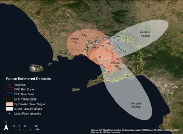
3rd place: Stephanie Martin, Vesuvius Past and Present: Modern emergency planning compared to ancient hazards
Abstract: This work illustrates how data from past disasters can be utilized to estimate risk for modern populations around Vesuvius. Records from the two most severe events in the past 5000 years show that pyroclastic flows (PDCs), ash fallout, and lahars from the Avellino (ca. 1900 BCE), and Pompeii (79 CE) eruptions caused abandonment of the area for centuries. The Italian Department of Civil Protection (DPC) defines Red, Yellow and Blue zones in which modern populations would be at risk from each respective hazard during a new eruption, yet these zones are significantly smaller than the known extents of ancient eruptions.
Undergraduate student winners
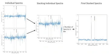
1st place: Reagen Leimbach, Stacking of Galaxy Spectra
Abstract: This visualization demonstrates a critical step in my analysis using spectral data from a galaxy survey called “DEEP2”. In order to detect the [OIII]λ4363 weak emission line to diagnose gas properties in galaxies, spectra are combined together for average measurements. This technique called "stacking" reduces random fluctuations. Individual spectra (left) are stacked (middle) using an averaging approach, which produces the composite spectrum (right). This stack of ~ 80 spectra yields a strong [OIII]λ4363 detection. Stacking is the equivalent of observing a single rare galaxy in the early universe on a large telescope for over 80 hours.
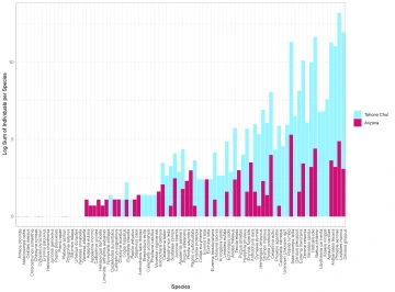
2nd place: Jazmyn Winzer, Botanical Gardens as Butterfly Hotspots in Urban Landscapes
Abstract: Public engagement is essential in ecological studies and conservation efforts. Citizen science allows the public to participate in research by collecting and processing data collection and processing. This practice in conservation promotes public interest in the environment and develops scientific methodologies that are easily communicated, while also producing research grade data. This study hopes to determine if data collected from citizen science databases, like eButterfly and iNaturalist, can help detect scale in urban butterfly diversity. We predict that butterfly species richness/diversity observed at Tohono Chul will match those of greater Tucson, as its green areas support butterfly diversity. Visit Jazmyn's GitHub.
3rd place: Rob Lucha, Wage & Value
Abstract: This Wage dataset was gathered from a user on Kaggle. To begin, I started with an exploratory data analysis to see the contents of the data. The data focuses primarily on Salary, Height, Sex, Race, Years of Education, and Age. A degree of preprocessing was required to further make use of the data. A linear regression model was used to determine correlations between salary and features within this dataset. Data was further preprocessed, and classification methods were used to make machine learning algorithms to make further inferences about our groups. A brief description of the findings have been included in the submission with each graph. Visit the data source.
